4 Easy Conversion Tweaks For Winery Websites You Can Make Right Now
Shopping cart abandonment is the bane of any winery’s digital existence. Here’s a few things you can do to save your users from jumping ship, and to convert them into buyers.
1. Speed up your website
Page speed isn’t strictly a conversion rate enhancement, but a slow website does heavily impact your conversions. That’s because our expectations of how fast a page should load are becoming increasingly high. According to ConversionXL, 57% of visitors will leave your website if it takes 3 seconds or longer to finish loading.
Your conversion rate optimization adjustments won’t matter if people aren’t going to stick around to use your website in the first place.
The easiest ways to see a significant boost in your website’s speed are compressing your images, using a caching plugin, and switching to high quality web hosting.
2. Use quality photos of your wines
We’re a visually oriented culture – why do you think so many wine consumers buy based on the label?
And why bother having a nice looking product if you aren’t going to feature it on your winery’s website?
Instead of outing a winery for doing a poor job at this, I’d like to show an example of one that’s doing an amazing job at it – Kenwood Vineyards.
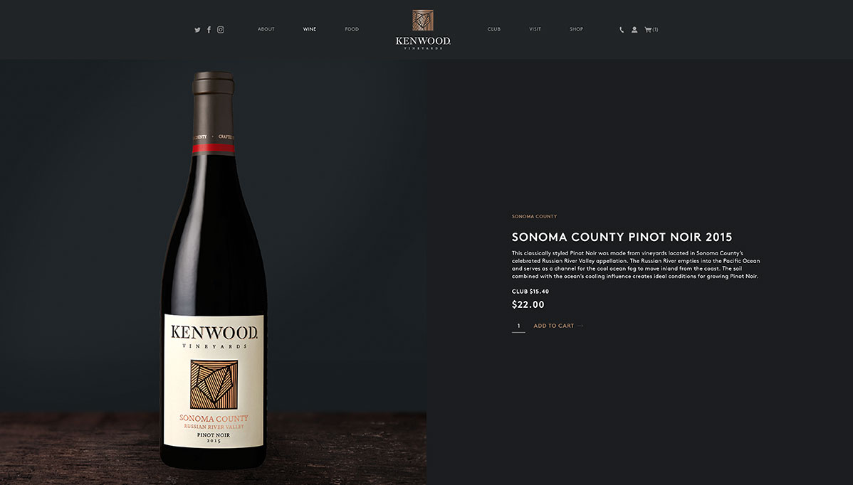
A detailed photo of your wine can seriously make the user want to press that “add to cart” button.
You can get this started right now, easily. If you don’t already have nice photos, just commission a professional to take them. When you’ve got the photos, simply add them to your website (which should be a breeze if you’re using a CMS like WordPress).
3. Break up the checkout process
When you’re asking a user to enter their shipping, billing, and credit card information all at once, you’re asking a lot. Not only does it feel like a lot, it looks like a lot. It overwhelms.
Below is a screenshot of a winery’s checkout process. It’s designed by a very popular e-commerce solution for wineries – makes you wonder how much they’re testing their service.
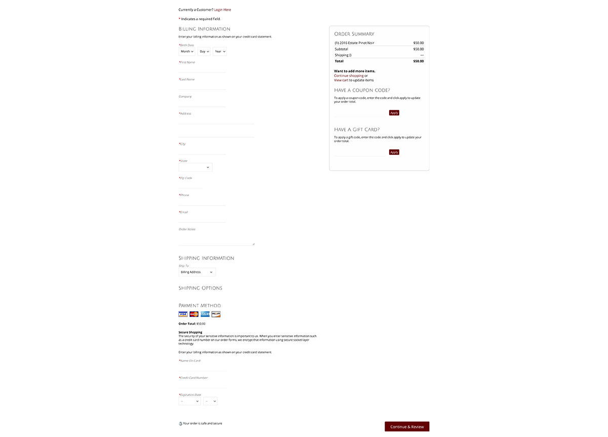
Instead of serving your buyers a huge checkout form, try breaking the process into multiple groups. Billing address for one group, with an option to ship to a different address. Next, put the card/paypal info in the second group. Finally, allow them to review the information and confirm the order on the third step.
If the idea of loading multiple pages turns you off to this idea, note that the steps don’t need to be on separate pages – a little javascript magic can show and hide each group as necessary, guiding your users through the process without visually overwhelming them.
4. Auto-fill the city & state
We’re used to filling out addresses as: City, State, Zip code. But lately, a different pattern has emerged that eliminates the need to fill in the first two at all.
By putting the zip code field before the city and state, you can make the zip code data automatically populate the city and state fields with a small amount of javascript.
It’s a small change, but the amount of mental work it saves the user goes further than you might think.
If javascript is all Greek to you, don’t worry! There are many web based tools that help you do it in a flash. Here’s one.
Test, test, and test again

Look, these tweaks have done well for us and should for you, but it’s really important to understand that CRO isn’t a one-size-fits-all game. Just because something yielded great results for us doesn’t mean it’s going to work for every winery in the world!
That’s why it’s critical that you test your changes and be sure they improve your conversions. Without testing and analytics, you can never know if a particular adjustment is working well.
Looking For A Conversion Rate Optimization Company?
If you’re in need of a full-scale CRO campaign, you’re in the right place. Drop us a line using the form below and we’ll be in touch.