Just like last year, we’re featuring the best winery websites that we’ve found in 2019.
If you’re looking to get a new website design for your winery, you can use this as a source of inspiration.
Some of the most important elements for a winery website to have are:
High-Quality Full-Screen Media
Full-screen photos and videos draw your viewers in to the experience of your winery, especially when used as a background.
Mobile-Friendly, Responsive Design
More than half of all internet traffic in 2019 is mobile. A winery website that looks bad or is hard to use on a phone will turn away visitors.
Strong Calls To Action
There’s no value in a pretty website that asks your visitors to do… nothing. Calls to action help guide visitors through your customer journey and get your winery an ROI.
These Are The Best Winery Websites In 2019
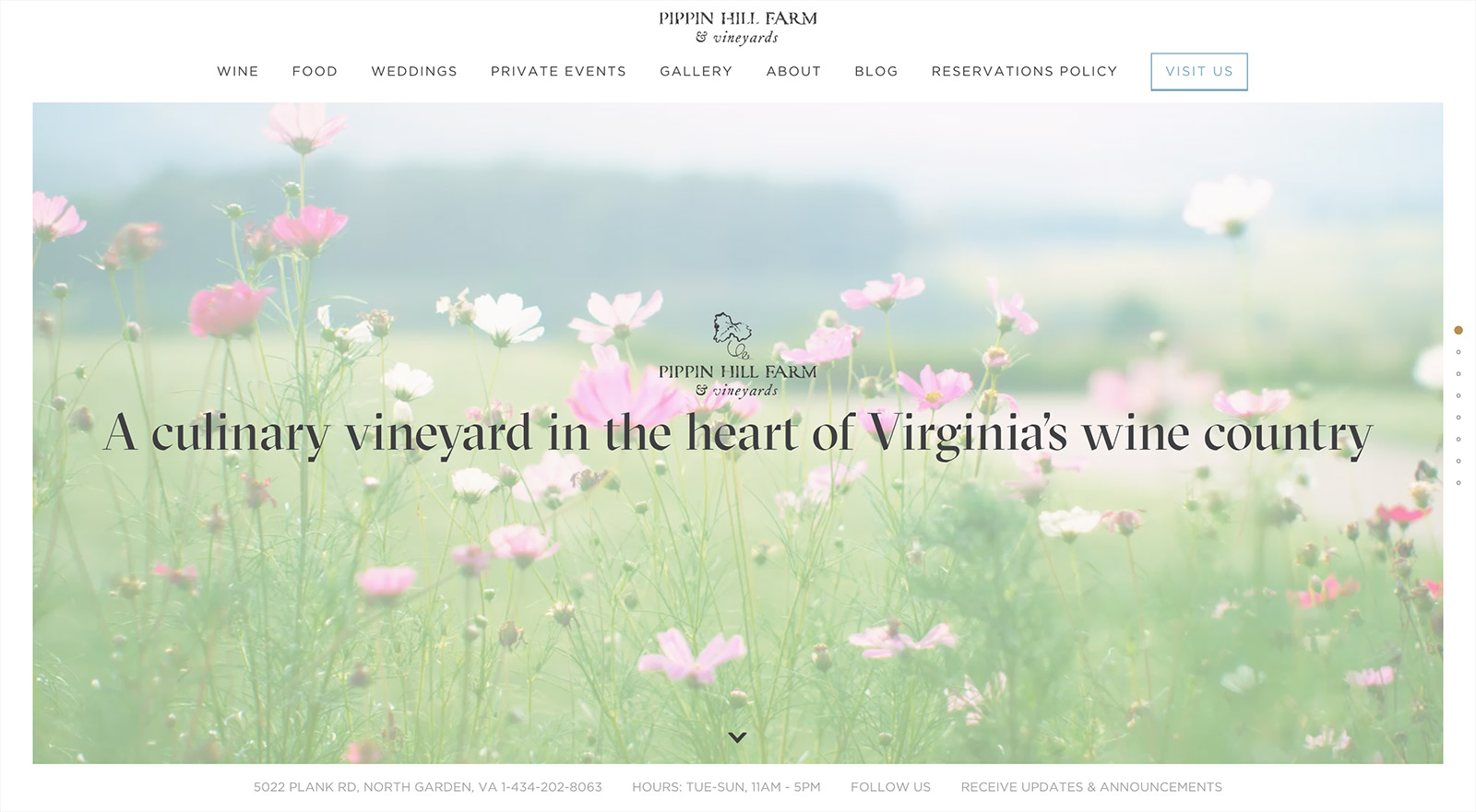
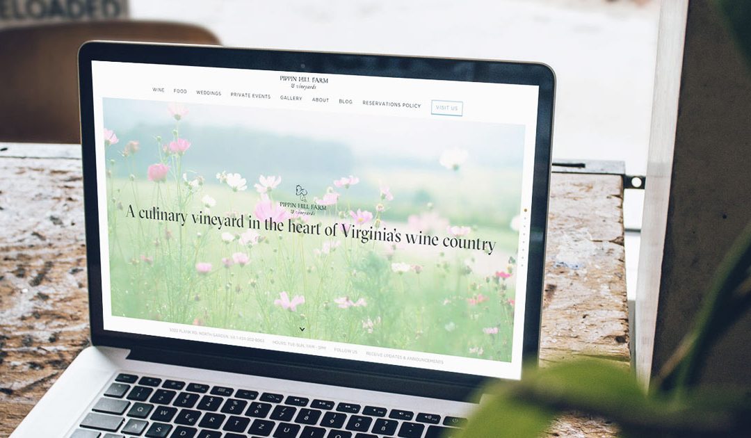
Pippin Hill Farm & Vineyards
Pippin Hill’s winery website is truly beautiful, due in large part to its unique typography and outstanding use of full screen photo and video. Their Weddings page is thoughtfully designed and functions as a strong sales page, with a call to action for wedding inquiries in the second section. Everything on this page sells the wedding experience — the social proof from Brides Magazine, the diverse photography, and the transitioning animations between each section. They’re also crushing their content marketing. Just check out their blog.
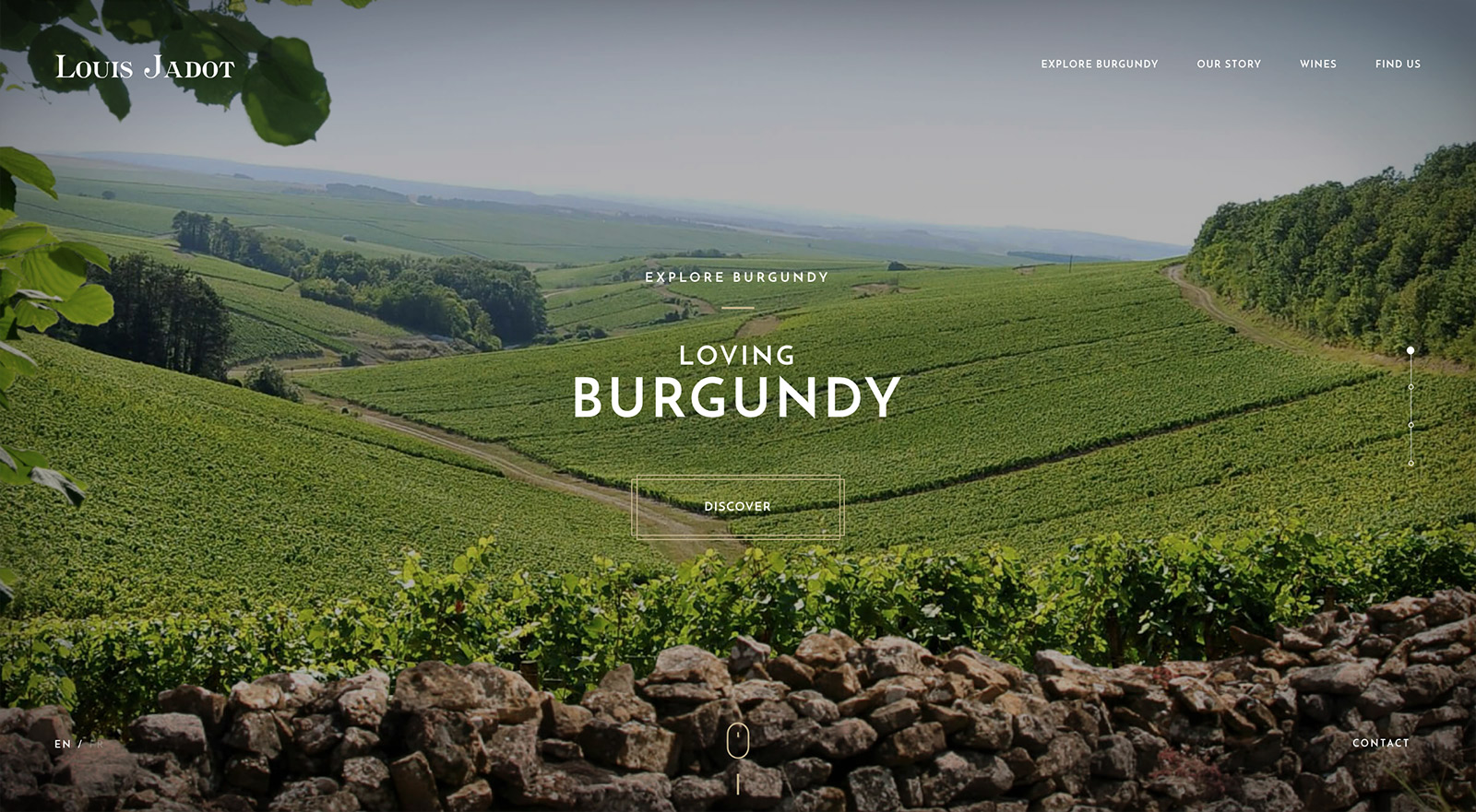
Louis Jadot
The website for Louis Jadot is wonderfully creative, eschewing the traditional grid-based structure in favor of a more asymmetrical approach. I think this is one of the best uses of scrolling animations I’ve ever seen, especially on the pages for each individual wine. One of the most impressive pages is the Explore Burgundy page, giving you a scrolling journey through each terroir and the option to deep dive into a given one. This is a quality website with strong branding and an intriguing experience.
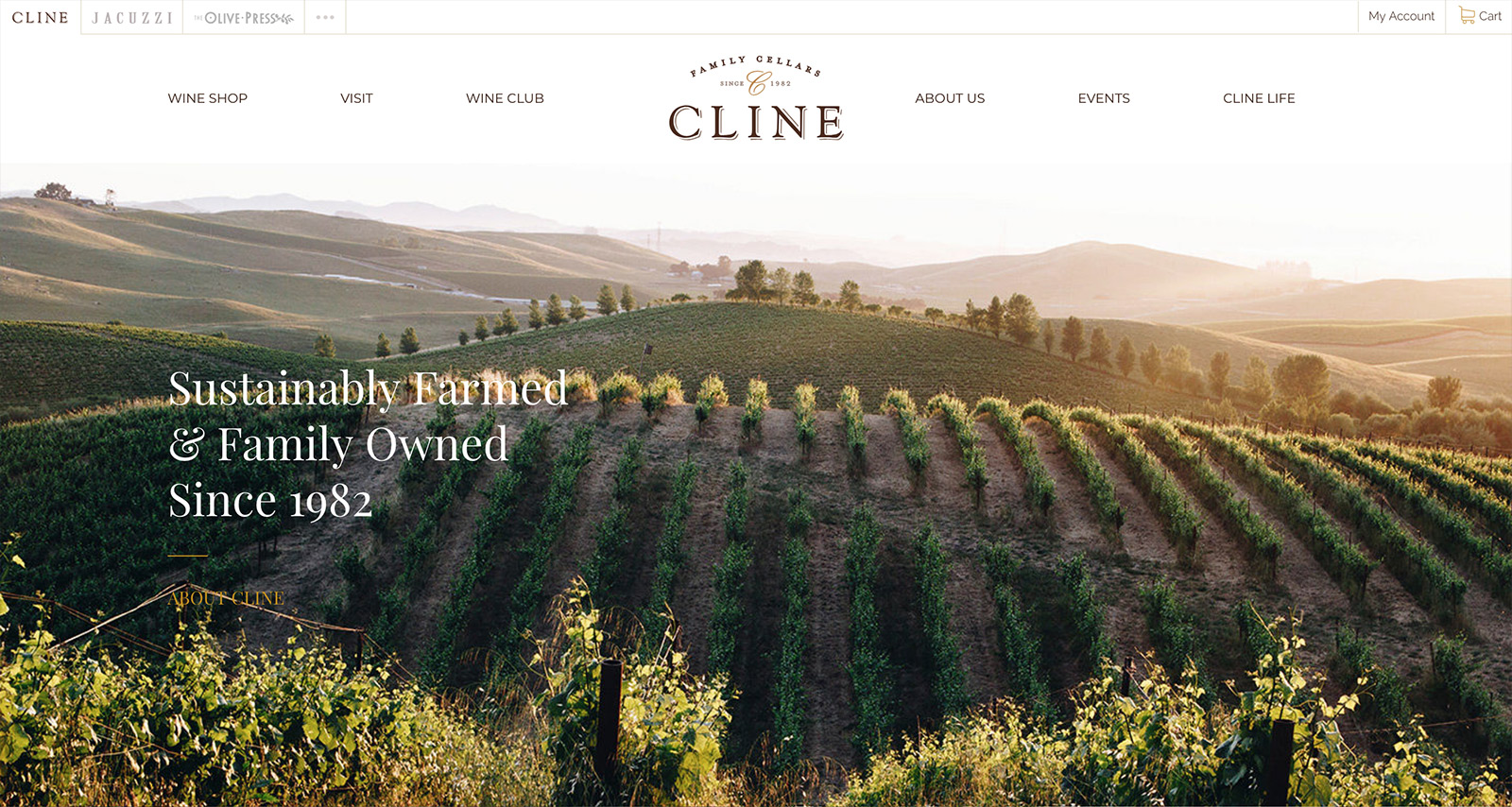
Cline Cellars
Cline Cellars is still one of the best winery websites we’ve seen, making great use of modern website elements like scroll transitions, lazy-loading, and masonry grids. The photography is beautiful, often featuring visitors enjoying themselves, thus making for powerful subconscious social proof. Overall their website is elegant without being too fussy, and its relative simplicity makes it easy to navigate. Definitely take notes on this one.
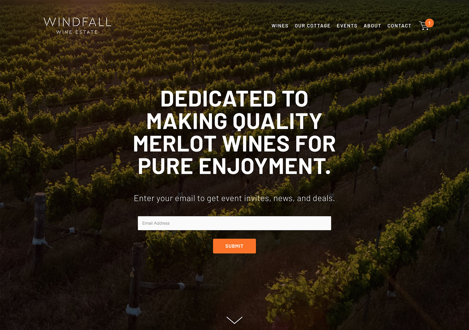
Windfall Wine Estate
Windfall Wine Estate has a website with a strong focus on photography and unique typography. A lovely background video and strong value statements on the home page make for a compelling introduction to the brand. They make great use of calls to action, and not just on the home page. The About page has a vertical timeline with a changing background for each section. The customer journey is well-planned, and every page tells a piece of the overall story.
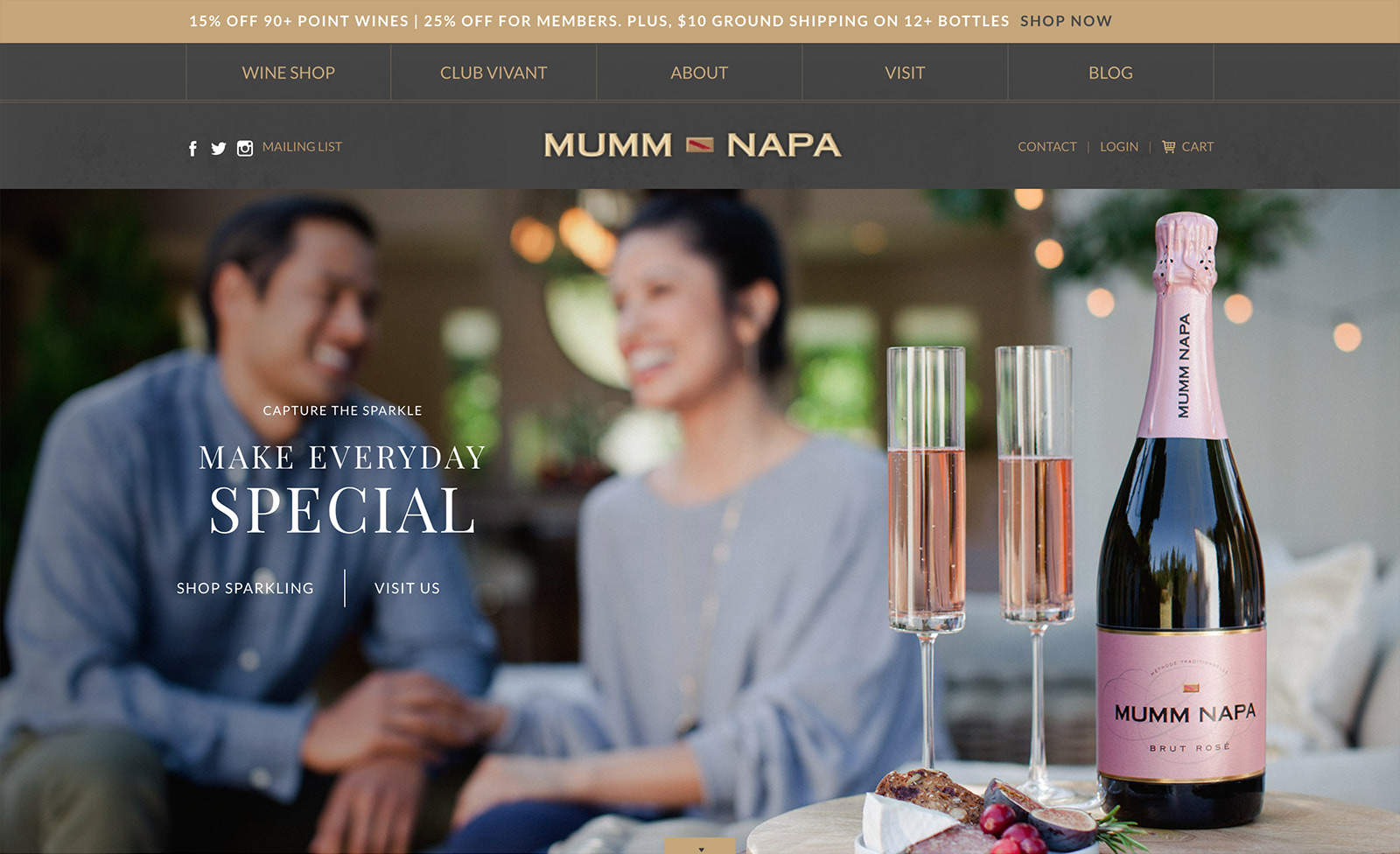
Mumm Napa
Mumm Napa’s website actually somewhat reminds me of Cline’s. They utilize two calls to action on the home page: “Shop Sparkling” and “Visit Us” — two valuable directions they’d want their viewers to take. Notice how almost every photo on the home page contains people enjoying their products. That’s sales psychology in action. I love the vertical timeline on the About page, and I also love the fact that they’re strong on the content marketing (see their blog). Excellent typography throughout, and the wine club levels are laid out really nicely. Finally, the site structure doesn’t try too hard, which makes it very easy to find your way around. This one is made by our neighbors at FINE, a design agency with locations in Portland and San Francisco.
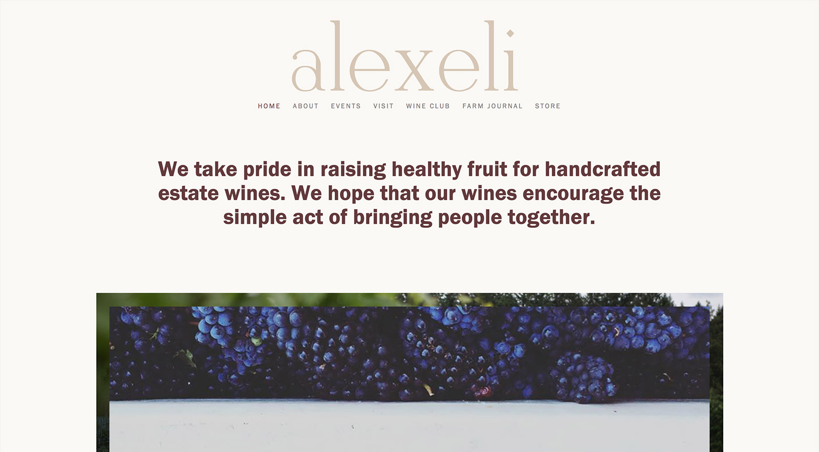
Alexeli Vineyard + Winery
We still love the simplicity and authenticity of Alexeli’s website. They have probably the strongest value statement we’ve ever seen, and its strong placement at the top of the home page is a genius move. This site eschews popular design trends, and is all the more successful because of it. Alexeli sets the focus of their website on their family, their process, and their humanity. This sets them apart from the pack, where the expectation is to focus on product, location, and social proof. The site is pure and egoless. It’s proof that you don’t always need a flashy, trendy website to communicate with a modern audience.
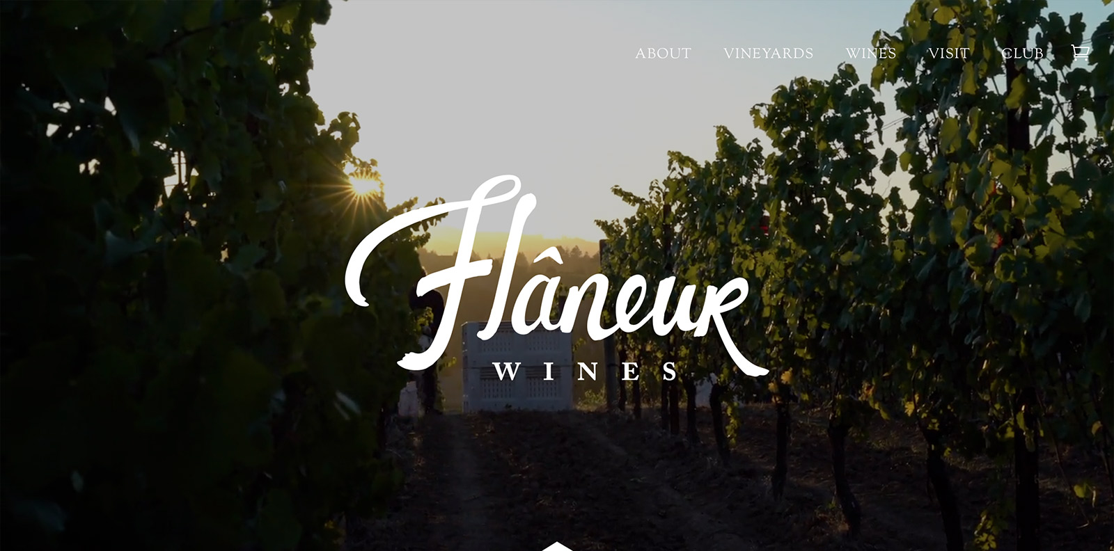
Flaneur Wines
The website for Flaneur makes great use of creative media, from the background video on the home page to the strong photographic focus on each page. I really enjoy the 2-up spread design that some of the pages have, like the Tastings page. Excellent typography and spacing overall. This one’s made by our neighbors at Vinbound Marketing, a digital marketing agency based in Carlton.
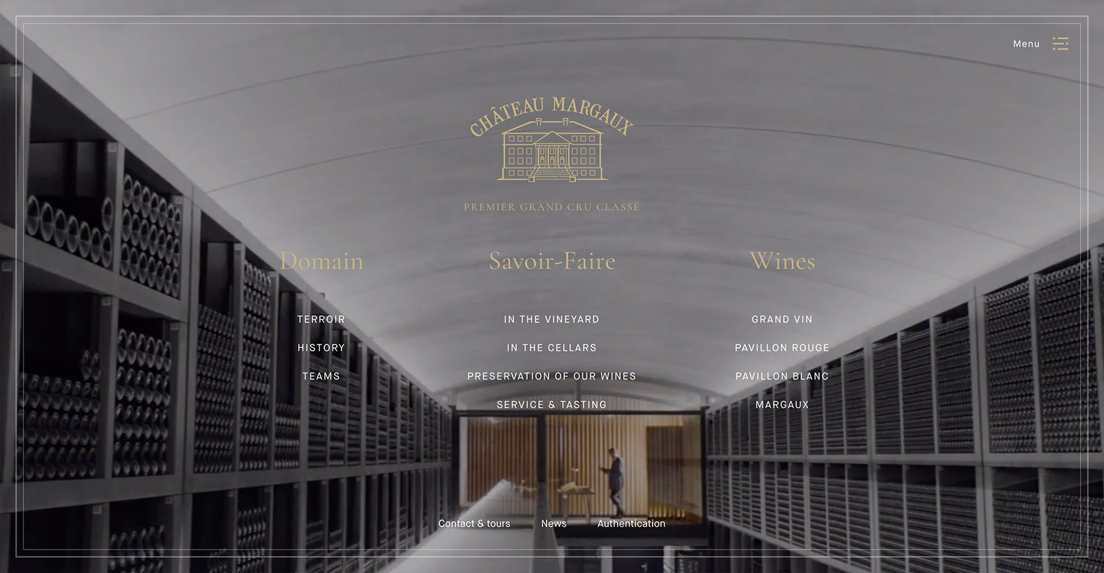
Château Margaux
Château Margaux’s website is fascinating, and not at all what we’re used to. The home page serves as a sort of portal for the rest of the website. The use of video is strong — just open the menu in the top right (desktop) and see what I mean. Their History page is awesome, with creative scroll transitions and interesting layouts. Their wines pages are certainly unique and interactive, with vintage history going many years back.
Considering a new website for your winery?
If so, we’d love to be of service. Let us know what you’re looking for below and we’ll be in touch soon.
Trackbacks/Pingbacks