4 Factors That Boost Sales On Winery Websites
According to the Baymard Institute, the average documented shopping-cart abandonment rate is 69.23%. That means that for every 3 people who add products to their shopping cart, about 2 of them will peace out. What do you think the abandonment rate is for your winery’s site?
I’ll tell you a secret: amidst the work I’ve been doing for wineries, I’ve been slowly chunking away on development of the perfect e-commerce solution for wineries. While doing this, I’ve been meticulously studying the online shopping systems of many different winery websites to see what’s working and what isn’t.
To be brutally honest, I’ve been seeing a lot more bad shopping experiences than good ones.
Having a smooth shopping experience is integral to selling more wine online, and it’s actually not that complicated to nail down. Here’s four prime factors that make a huge difference, but many wineries seem to be getting wrong:
#1 Actually have a shopping cart
Have you ever been to a wine shop where the bottles were totally inaccessible, and you had to order from a list at the front desk? Probably never, right?
Nobody in their right mind would set their store up that way. To not be able to hold the bottles and carry them with you through the shop would be a terrible experience for the customer.
And yet, I’ve seen a shocking number of winery web pages doing just that. It’s a cold, boring process that doesn’t allow you to connect with the item you’re purchasing. And it makes the task of checking out look daunting, because you have to fill out a huge form all at once, noting the quantity of each wine you want and filling your address and billing info at the same time.
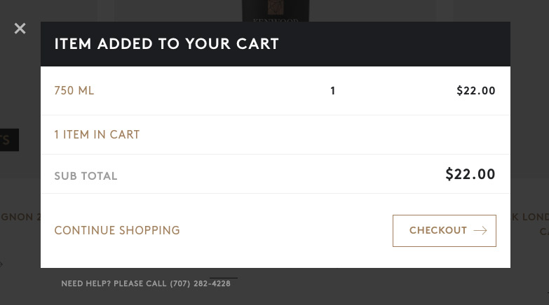
Instead, invest in a quality e-commerce solution for built for wineries. Squarespace isn’t what you’re looking for here, especially considering it’s against their Terms of Service to sell alcohol.
There are a number of reputable e-commerce providers to choose from that will implement a shopping cart system on your website. Going with one of these will drastically improve your site’s online shopping experience, thereby increasing your wine sales. Alternatively, you could pay a professional to make you a custom one – which we do, by the way!
#2 Use high quality photos of the bottles
I say this all the time, but I’ll say it again – our culture is very strongly focused on the visual aspect of things. There’s a reason people pay for high quality photography of their wine bottles – it sells.
If you’re not showing photos of your bottles, add some! All you need is one professional shot of each bottle.
That’s not the whole game though. I’ve seen some wineries with great looking photos that are just way too tiny to be enticing. A fantastic photo is worthless if it’s too small. Make your photos large – especially when a user clicks one of your wines to view the details on its specific page.
And, marginally related, on these pages you should provide as much information as you can provide about the wine. Kenwood Vineyards does an incredible job at this – they even give you the nutritional information, carbs and all.
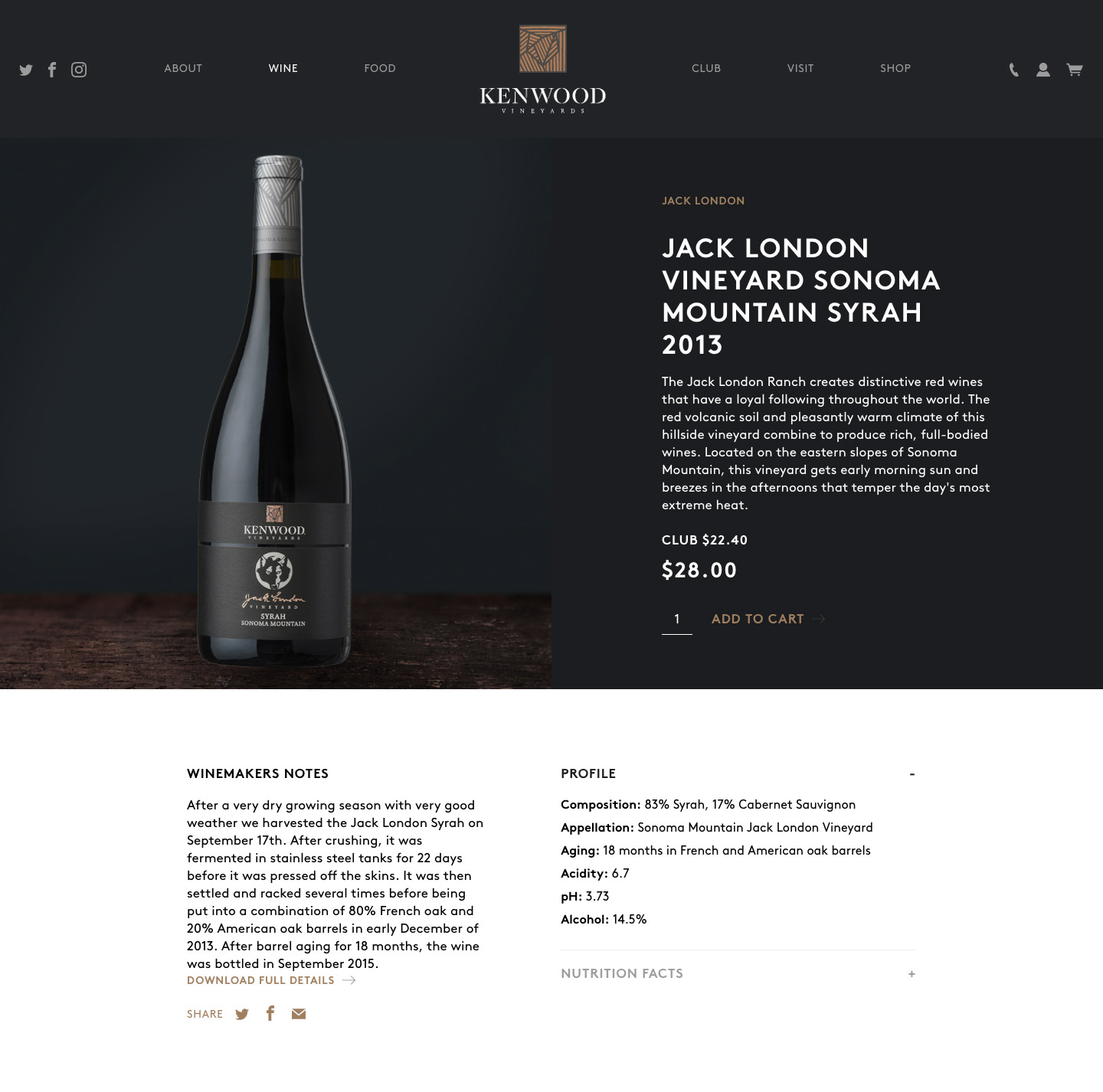
As a consumer, I personally love seeing such detailed information about the wines I’m buying, and I’m more trusting of the wineries who present it for me.
#3. Simplify the navigation

Easy navigation sounds like a simple enough task, but some companies spend millions of dollars on it. It’s not always intuitive how to make your website’s navigation… intuitive.
Plain and simple, if it’s even slightly difficult to figure out how to get from your home page to clicking the “sign me up” button for your wine club, you’re leaving money on the table.
Of course, it goes beyond just having a link in your top navigation menu that says “Wine Club.” It’s the whole process. If the only button to join your “reds-only” club is buried near the bottom of a massive page of content, that’s poor navigation and a missed opportunity.
Make it stupidly-easy for users to view their shopping cart, check out, and get back to viewing the wines they were browsing from every point.
Don’t hold users off from viewing the wines by making them select categories before they can see all the wines. Categories should be used to filter down the wines that are shown, not to act as a gate between the user and the wine. You don’t have to pass through a special gate in wine shops to view a certain varietal. It’s all there.
Above all else, keep things simple and ask your honest friends how easy it is to get around on your site. Ask them to find something, like your contact info, or your wine club signup form.
#4. Make check-out a breeze

There seems to be a common thread among many of these factors: make things as easy as possible. It’s especially true of the checkout process.
People talk about the merits of single-page checkout vs multi-page checkout, but according to the Baymard Institute, there isn’t any discernible difference between the two in terms of abandonment.
What’s more important is presenting the information in the right order, without any surprises, and automating as much as possible.
Something that’s REALLY useful is to have a checkbox for billing/shipping address matching. Many people have the same shipping address as their billing address, and having to enter the same information twice is a turn-off. A little javascript magic can make a huge difference by eliminating the hassle.
Using the proper HTML input tag types also help speed up checkout for the user. Browsers today store information like the billing address for future use, and if you have your inputs set to the proper type, it allows the browser to suggest the right info for each field. That way, the user doesn’t have to type much more than the first few letters of their name.
At the end of the process, make it easy for the user to jump back to any point (shipping address, card info, cart items) and modify something if necessary. Don’t make them rely on their browser’s back button for this.
Don’t force the user to register an account on your site in order to checkout. Guest checkout is imperative to dropping your cart abandonment rate.
Finally, it’s important not to hide the shipping cost until the end. You don’t want to surprise the user with shipping fees just before the “confirm order” button. Show it to them up front and early.