This article covers the best winery websites in 2020.
It’s a new year, and a great time to find inspiration from some of the most excellent winery websites on the internet.
If you’re looking for current trends, you’ve come to the right place.
The Best Winery Websites In 2020
Here are our top choices for outstanding winery website design in 2020:
- Arrowleaf Cellars
- Adelsheim Vineyards
- Bar Z Wines
- Bluemont Vineyard
- Hazelfern Cellars
- RDV Vineyards
- WillaKenzie Estate
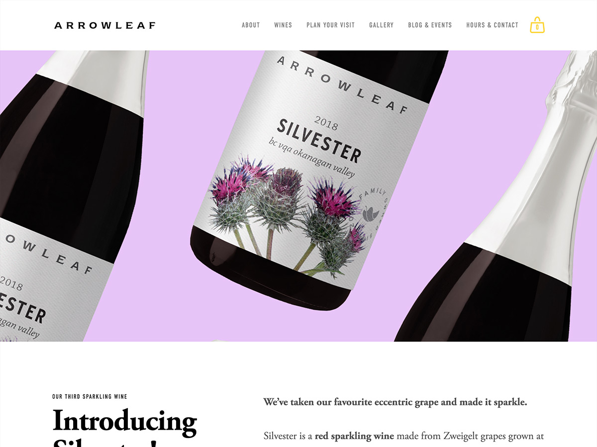
Arrowleaf Cellars
Outstanding product photography, expert use of color, and brilliant typographic choices make this a winner. Arrowleaf’s website properly utilizes Squarespace’s clean layouts and eminently readable typography with great success. Arrowleaf clearly understands the power of brevity in copywriting, and even on pages that are mostly comprised of text, the space between lines is large enough to make reading a breeze. With template-based websites, Design-It-Yourself wineries can sometimes overcomplicate and lose the essence of what made the template great, but Arrowleaf makes no such mistake here.
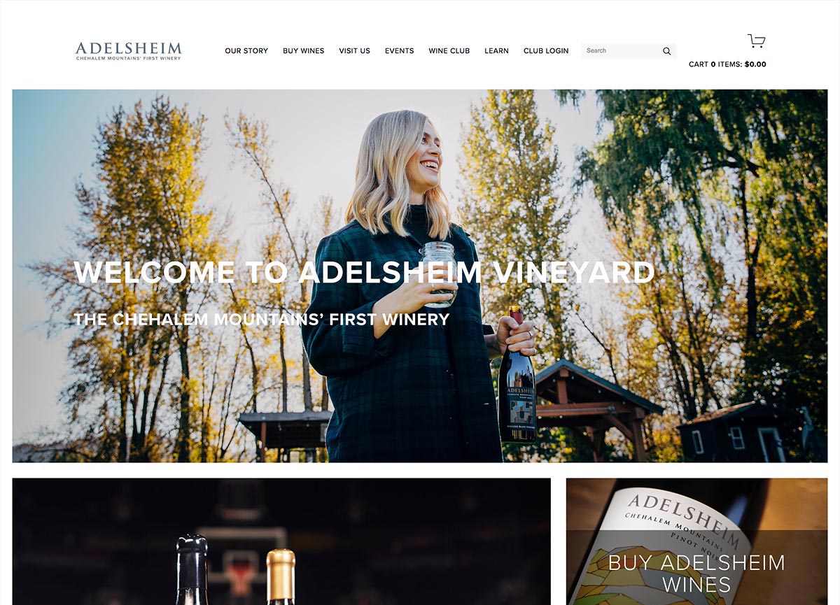
Adelsheim Vineyards
Adelsheim’s website is full of excellent photography and a focus on people, rather than solely wine bottles. This is important, because when you get right down to it, you’re not selling a bottle of wine — you’re selling the human connection, emotion, and memories that bottle can bring your customer. Adelsheim clearly understands, placing people in almost every photo across their website (save for the individual wines in the shop, obviously). This, coupled with their clear navigation structure and readable fonts, take Adelsheim’s website from being just another Squarespace website, to a valuable lesson in online presence for wineries everywhere. Plus, something about the vibe of their website is just fun, and the video instructing how to pronounce their name is evidence of that.
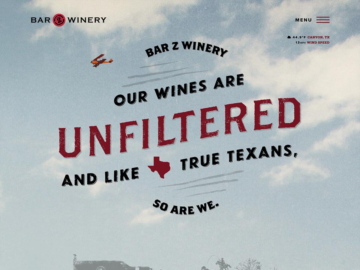
Bar Z Wines
Speaking of fun, how do you like that headline? Bar Z Wines has one of the most unusual winery websites we’ve seen, coming across almost as more of a brewery or restaurant vibe, but that’s what makes it special. It’s anything BUT another winery flashing their vines and grapes and bottles in every photo, and this distinguishing factor sets them apart in a successful way. Bar Z’s website design commands attention, with their grainy/textured effect, fun animations (the airplane, the cow, etc), and amusingly “unfiltered” copywriting. Their website is WordPress, and works great on mobile, of course.
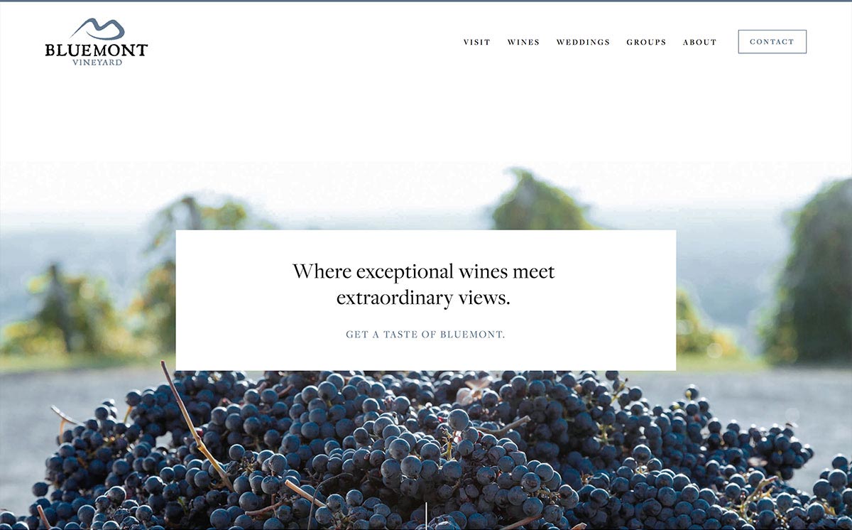
Bluemont Vineyards
Bluemont’s website oozes professional design, with brilliant use of color and unique typography (though the body font feels somewhat small). Couple that with wonderful photography and a refreshing use of white space (the padding between sections), and you have a recipe for success. The branding is just effortlessly consistent from page to page. I wouldn’t have been able to tell you this was a Squarespace website without looking at the code.
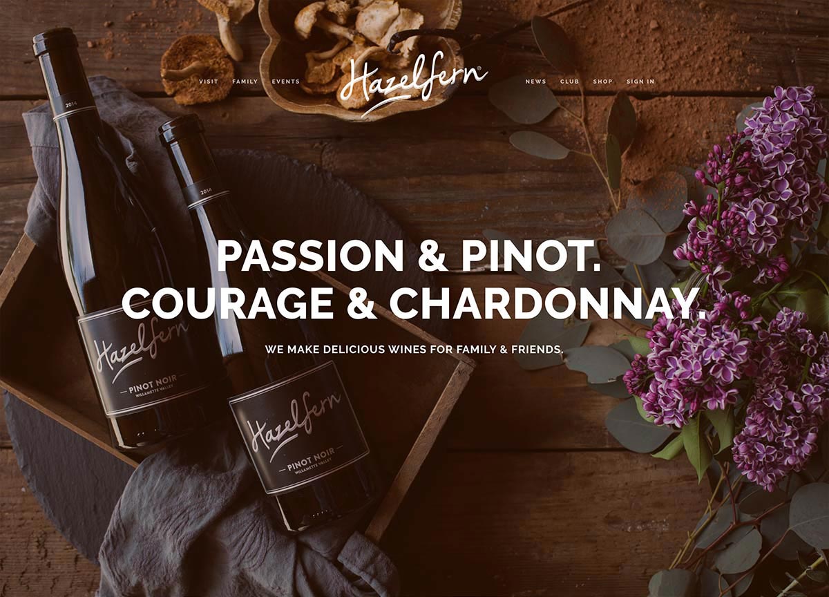
Hazelfern Cellars
Hazelfern’s website is utterly unique and truly beautiful. The videos of the musicians at the bottom inject personality and strengthen the Hazelfern vibe wonderfully. On the shop page, their product photos are so, so beautiful. With its expert use of headlines, Hazelfern’s website feels like they must have read Donald Miller’s StoryBrand and put it into action. Wineries unfamiliar with Donald Miller should absolutely give his book a read (we are not affiliated, just fans).
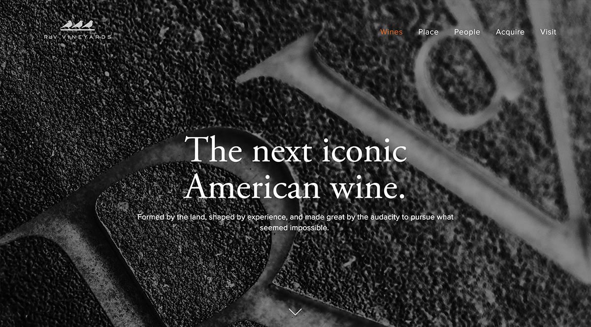
RdV Vineyards
The skillful use of full-width backgrounds on RdV’s website creates a very intentional mood, and it helps that the photography is amazing as well. And, maybe we’re biased in favor of Garamond, but the font pairing on this winery’s website is superb. This website tells a story in a very compelling way, and everything just works together to form a cohesive brand. Give their website a look through, because, to steal a quote from their Visit page, the best way to truly appreciate RdV’s website is to experience it for yourself.
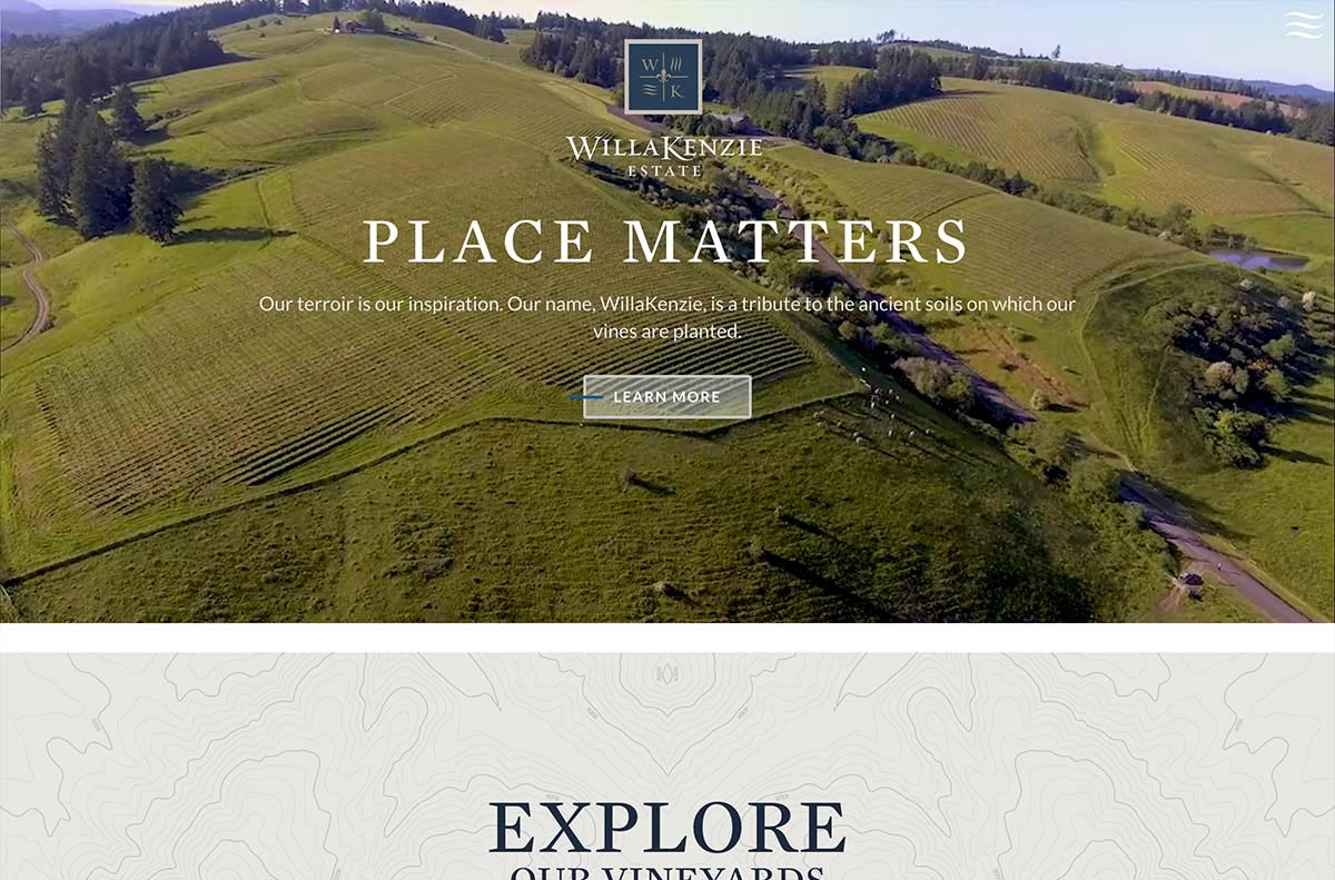
WillaKenzie Estate
Background video, strong branding, and its intuitive and uncomplicated user experience make WillaKenzie’s website a winner in our books. Their Cellar Club is very easy to understand, and the topographical map theme tastefully ties the website together. As a viewer, things just “make sense” when browsing, even when there’s a good deal of information to take in. And does it look good on a phone? You bet it does.
Next Steps
If you’re looking to upgrade your winery’s online presence, you’re in the right place.
Drop a line to us at [email protected] or use the form below to get in touch, and let us know what you’re looking for.
How We Curated This List Of Winery Websites
We looked through 1000+ winery websites across the globe to find these gems.
Here are a few main criteria we looked for when curating this list of the best websites:
Beautiful, Professional Media
High quality photography and video work makes a huge difference on your website, and works great when used as a background behind your content.
Responsive (Mobile-Friendly) Design
Well over half of all internet traffic in 2020 is mobile. If your winery has an online presence that is outdated and hard to use on a phone, you are losing potential customers and tasting room visitors.
Clean, Readable Typography
Studies have shown that sans-serif fonts are the easiest to read on screens for body copy, and having a thoughtfully-designed typographical hierarchy makes all the difference in website readability. And in general, the fewer words you can use to get your message across, the better.
Effortless Navigation
The best winery websites don’t make their visitors think — finding what they’re looking for is intuitive and just makes sense. Minimizing navigational complexities, as well as understanding and simplifying the user journey, sets the winners apart.