Why Your Winery’s Website NEEDS To Be Responsive
You’ve probably heard it a million times by now: your site needs to be responsive. This is, unfortunately, still a very relevant recommendation for wineries, whose websites often seem to be trapped in a vortex from ten years ago.
At this point, everybody is aware that Google punishes your site for having a poor mobile experience, and for a slow load-time. They punish you by throwing your site below every other winery with a website that does serve a good user experience on phones and tablets.
From a business standpoint, it makes sense why Google would do this: as the number one search engine in the world, they want the search results they serve to be the best quality available, and to show outdated websites that most people are likely to leave and never return to would be counteractive to that goal.
Everybody knows that the first thing most people do when they wake up is pick up their phone and stare at it for twenty minutes. They know that purchases are happening more and more frequently on tablets and smartphones, including wine purchases. They know that they’re missing out on tons of opportunity if they don’t have a mobile-friendly website.
Everybody knows! So why another article about it?
“Knowing is not enough, we must apply. Willing is not enough, we must do.”
Now is the time for action. It couldn’t be more imperative. Well, actually it could; it certainly will be even more imperative next year when the stats shift in favor of mobile even more drastically.
Don’t believe me? Maybe it’s really not that big of a deal. “I still use my computer for internet, so probably everyone else does too.” Hey, you’re not wrong. But there are certain behaviors that people engage in when they use certain devices, and certain hours of the day when people use those devices. The image below shows the peak hours for computer usage are during the working hours of the day, with mobile phones and tablets taking a strong lead during the other hours:
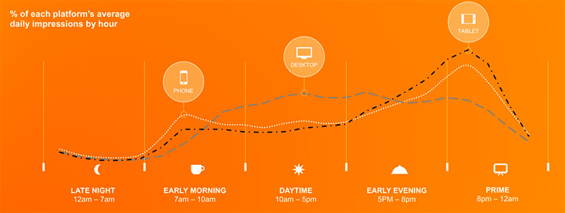
Image courtesy of Smart Insights
It can be difficult to grasp this concept because we can’t miss what we didn’t already have. So maybe these new stats will help, because the numbers are growing at a crazy rate.
The Numbers
In October 2016, a media-buying company called Zenith predicted that at least 75% of internet use would be mobile (up from the high 60’s in 2016). To tell you the truth, we’ve probably eclipsed that number by now, and the year still isn’t over.
Very pertinent to winery websites, 72% of online searches in the Food & Beverage industry are mobile. But 57% of users say they won’t recommend a business with a poorly designed mobile site.
Visitors are 90% more likely to leave a website that takes 5 seconds to load than one that takes 1 second to load. If your winery’s site takes 3 seconds or more to load, 53% of people will peace out. Basically, if your load speed isn’t really good, you’re losing TONS of potential consumers. Don’t settle for average here.
All of these things heavily affect winery websites. So what are you to do? If knowing is not enough, what action must be taken?

How To Make Your Winery’s Site Become Mobile Friendly
If you’ve got a mind for HTML, CSS, and Javascript, you’re in luck! You probably already know how to do it, or understand enough to look up articles on how to do it.
The basic premise is this: have only one version of your website that adjusts at pre-defined “breakpoints” (or “device widths”). Use CSS media queries to set these breakpoints, and use common sense to set them at the pixel widths for common tablet and smartphone screens. Bonus points for using a framework like Foundation or Bootstrap, which will set these breakpoints for you and give you a strong grid-based framework you can use to divide sections of your page up into rows and columns. Just make sure your winery’s site is customized enough so it doesn’t “look like Bootstrap.”
Or, if you’re not a coding superhero, just do what everyone else who values their time does and hire a professional to do it for you.
This is the more sensible option, because if your website isn’t mobile-friendly, chances are it needs a design update anyway. It’s much easier to make a new responsive website than it is to force an old website to suddenly work well on mobile phones. Just remember: a trustworthy web designer won’t charge you extra for making a new design mobile-friendly.
Need a hand?
It’s almost 2018 – time to show the wine consumers you’re with the times, and care about their experience. If you’re not much of a programmer, we’re here for you. Get in touch with us using the form below, even if you just want to ask a question.