Originally posted April 14, 2017; Updated February 16, 2018
👉 Check out our updated article for the best winery sites of 2019!
For wineries, a professional website is both a vital branding piece and a valuable direct-to-consumer platform. If wine consumers have high expectations for the wines they drink, you know they have equally high expectations for the websites they choose to visit as well.
I decided to compile a list of what I consider to be the best winery websites out there today, to serve as a source of inspiration.
3 Common Factors Of The Best Websites
Large, High-Quality Imagery
Full-screen photos have a powerful effect on website visitors, drawing them in to the experience of your winery.
Large images used to cause slow load-times, but technology is now at the point where that’s not really a concern. Almost all the top winery sites are using them without fear.
Background Videos
Videos look awesome, capture your visitors’ attention, and allow you to tell your winery’s story in a beautiful format. Just make sure to compress your video files!
Mobile-Friendly, Responsive Design
Having a site that functions properly on a smartphone is essential to its success, especially when 61% of users are unlikely to return to a non-mobile-friendly site.
With so many people using their phones to browse, it’s no surprise that mobile-friendly design has become a requirement for the best websites out there.
Here Are The 13 Best Winery Websites In 2018
With the above factors in mind, let’s take a look at the websites we’ve selected (in no particular order). Note that the factors are not a requirement for a winery’s website to make the list.
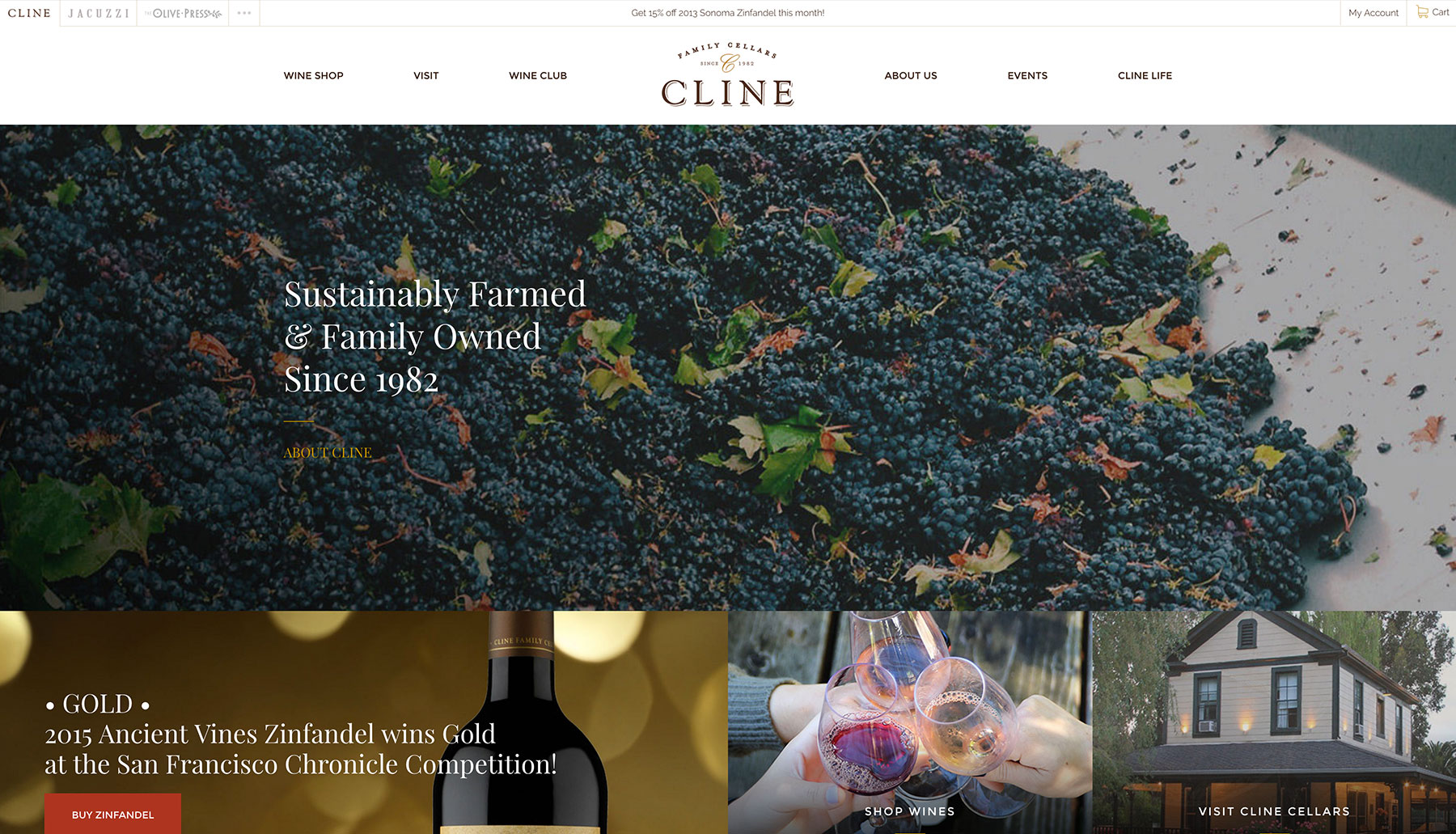
Cline Cellars
Overview
If you check out just one website from this list, make it this one. Cline Cellars’s site is a masterclass in what a modern winery website should be. They just get everything so right.
To start, they use eye-catching modern website techniques like scroll transitions, lazy-loading, and a masonry grid style. This makes the user experience more interesting and more polished.
Cline’s website has absolutely beautiful photography, and text is almost always paired with a nice photo. Many of their photos feature visitors enjoying themselves, which make for powerful social proof. Their Wine Club and Weddings pages are highly detailed, they have a section for recipes and pairings, and they’ve implemented a rare technology to find: a virtual tour.
The only thing I don’t care for is that when trying to shop their wines, you’re forced to choose a category before you can see any product at all. Then, once you’ve chosen a category, sometimes you’ll only see that there are three or four wines in the list.
Aside from that, this is a truly outstanding site – most definitely one to take notes on.
What’s Working
Pretty much everything. They’re one of few wineries with a virtual tour.
Areas for Improvement
Wine Shop – don’t make me choose a category before I can see any wines!
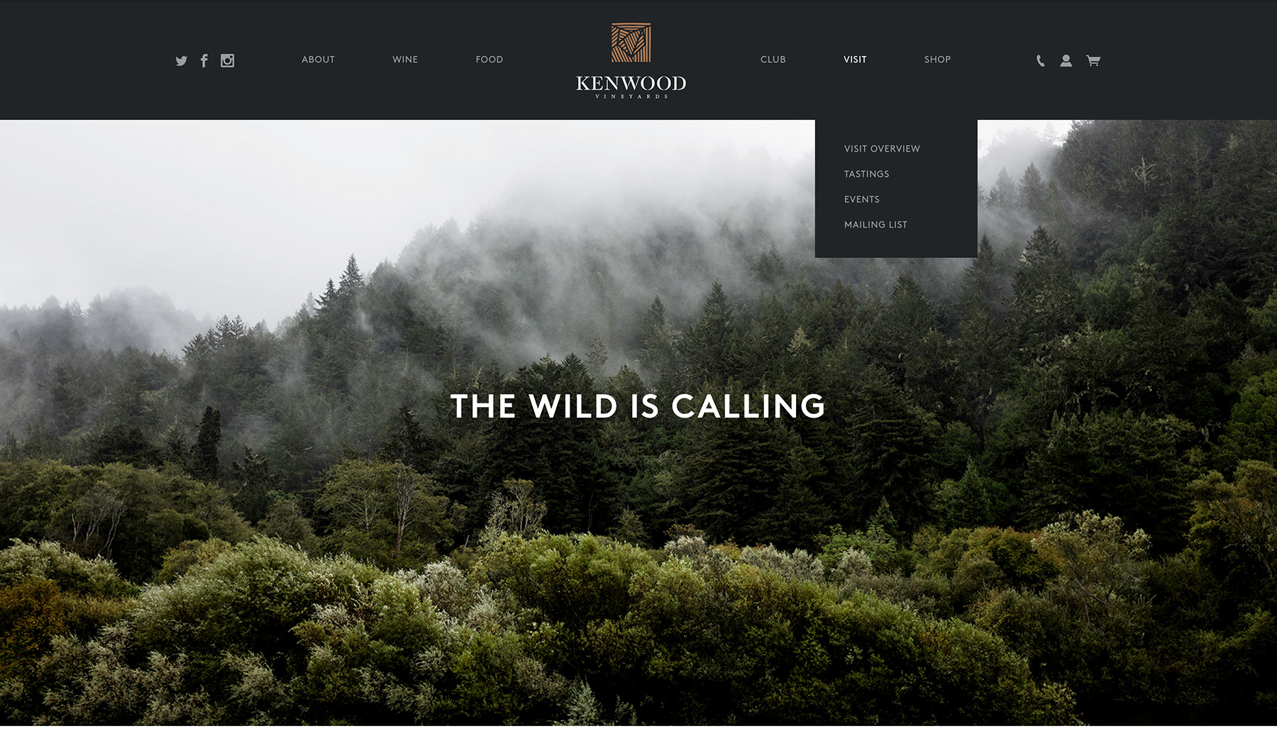
Kenwood Vineyards
Overview
Kenwood Vineyards’s website has amazing photography, with a strong focus on nature. As a result, its design feels both luxurious and completely unfussy. Their typographical hierarchy is also very well thought out, making it easy to read through a page.
I often comment on the poor experience of being forced to select a category before you can see any wines, but on Kenwood’s website I’m able to look past it because they do an awesome job at presenting their categories.
I love their Food page, and I also appreciate that they have a separate page for each of their wine club membership options. Finally, I really enjoy the way the present their vineyards, each with fine details such as the altitude and climate.
I’m not sure they could do anything better, though I am always annoyed at the age-verification that pops up when you haven’t visited the site in a while. And I’m not the only one.
What’s Working
Very powerful photography and a unified focus on their nature theme. Fine details throughout the site. Clean, spacious design.
Areas for Improvement
I hate the age-verification barrier, easily subverted by lying and nothing more than a nuisance to those of legal drinking age. However, this may be necessary for them if they run advertisements.
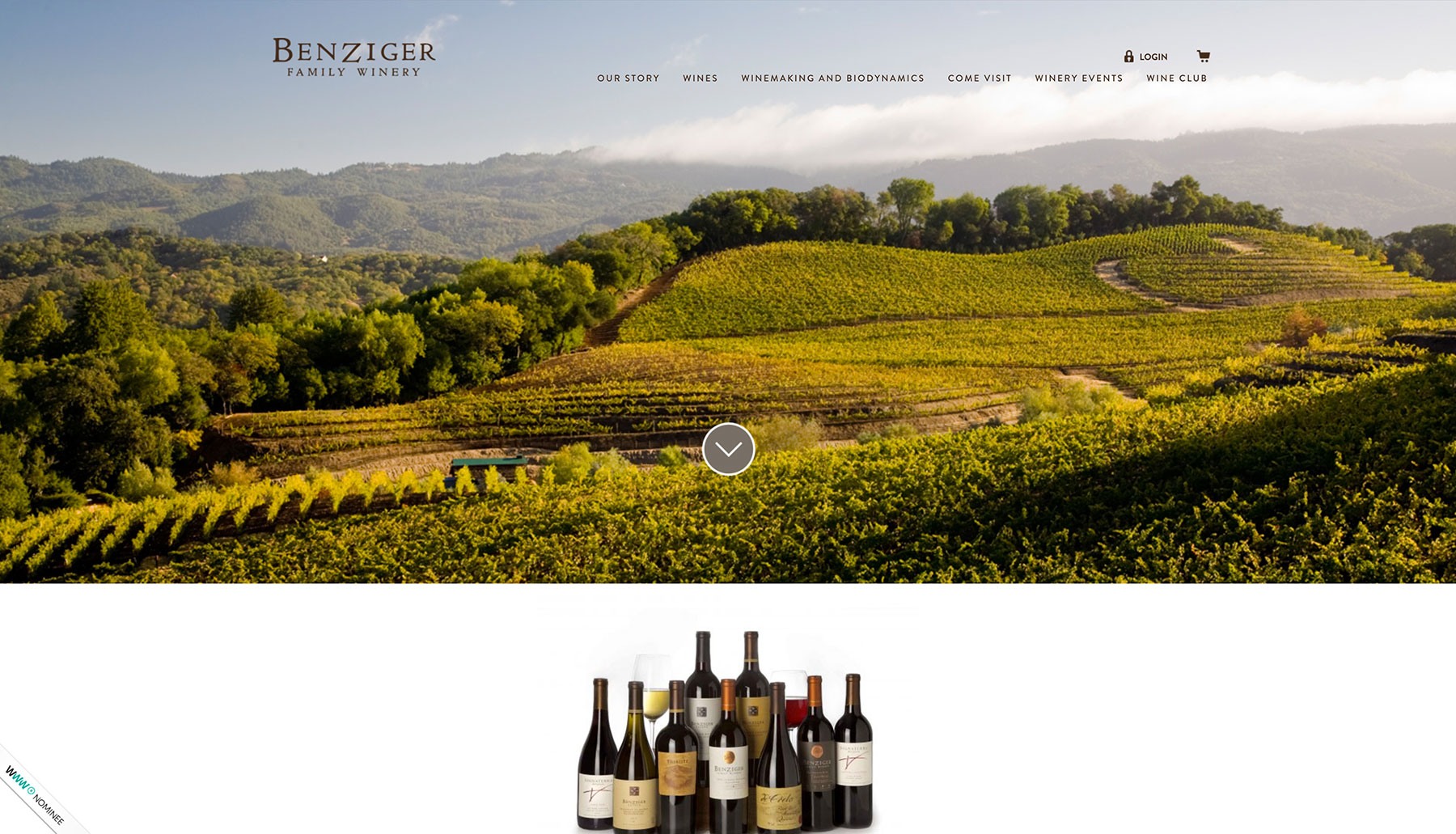
Benziger Family Winery
Overview
This site has a really lovely design and no shortage of unique features. Check out their Our Timeline page and scroll through this winery’s history. Information is always laid out with a generous amount of space, making it easy to read. The calendar on their Winery Events page has a great responsive design.
However, I almost didn’t put it on the list because of how bad the top navigation menu is. When moving the mouse over many of the links, your experience is completely disrupted by a gigantic popup sub-menu that makes it impossible to click (or even see!) the link you were hovering over and every other link beside it.
Still, Benziger has a great website that makes excellent use of large-scale photography and a clean design. And apparently, I’m not the only one who thinks so! Cheers to them.
What’s Working
Unique presentation of their history and calendar events. Clean design. Nice large photography.
Areas for Improvement
The top navigation menu could definitely use a re-work.
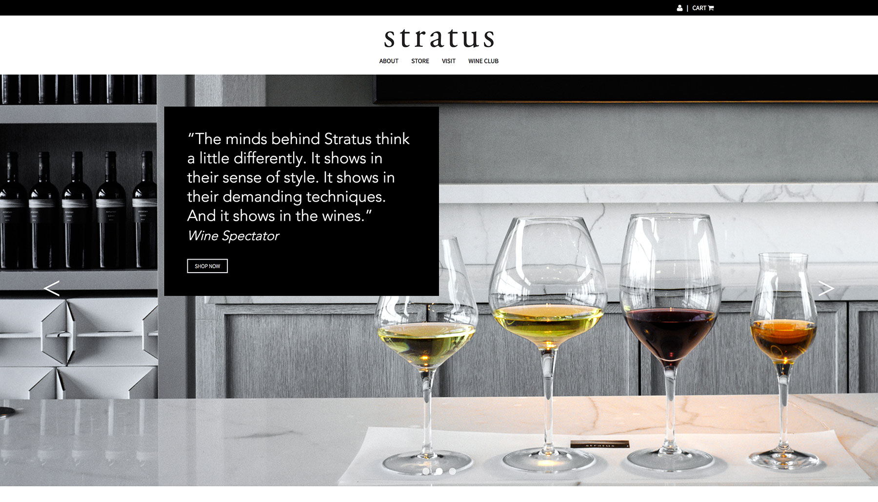
Stratus Vineyards
Overview
With an ultra modern, ultra minimal approach, Stratus’s website makes some very interesting design choices and comes equipped with a Google Maps integration at the bottom. Their map integration doesn’t interrupt the user’s scrolling motion – something that Highway 12, discussed further down this list, needs to adjust on their site.
The site adheres to an almost editorial-like grid system, which makes it very easy to read and follow. When browsing their online shop, products are immediately visible which is always a good sign. As a consumer, I love the specific details they share about each wine.
I will say that the pagination button at the bottom of their wines list is a little confusing, as it has the gestalt of a singular button when in fact it is two in a single box (the second clickable arrow only appears when you’re on page 2 or higher). This navigation style works better on their Visit page, where both arrows are shown. I also noticed that sometimes they use too many images in a small space (see About page, for example), but that’s just a minor complaint.
What’s Working
Very unique, minimalist design. Excellent Google Maps integration. Wines immediately visible when shopping.
Areas for Improvement
Pagination at the bottom of the wines page could use some tweaking. Minor image cramping at times.
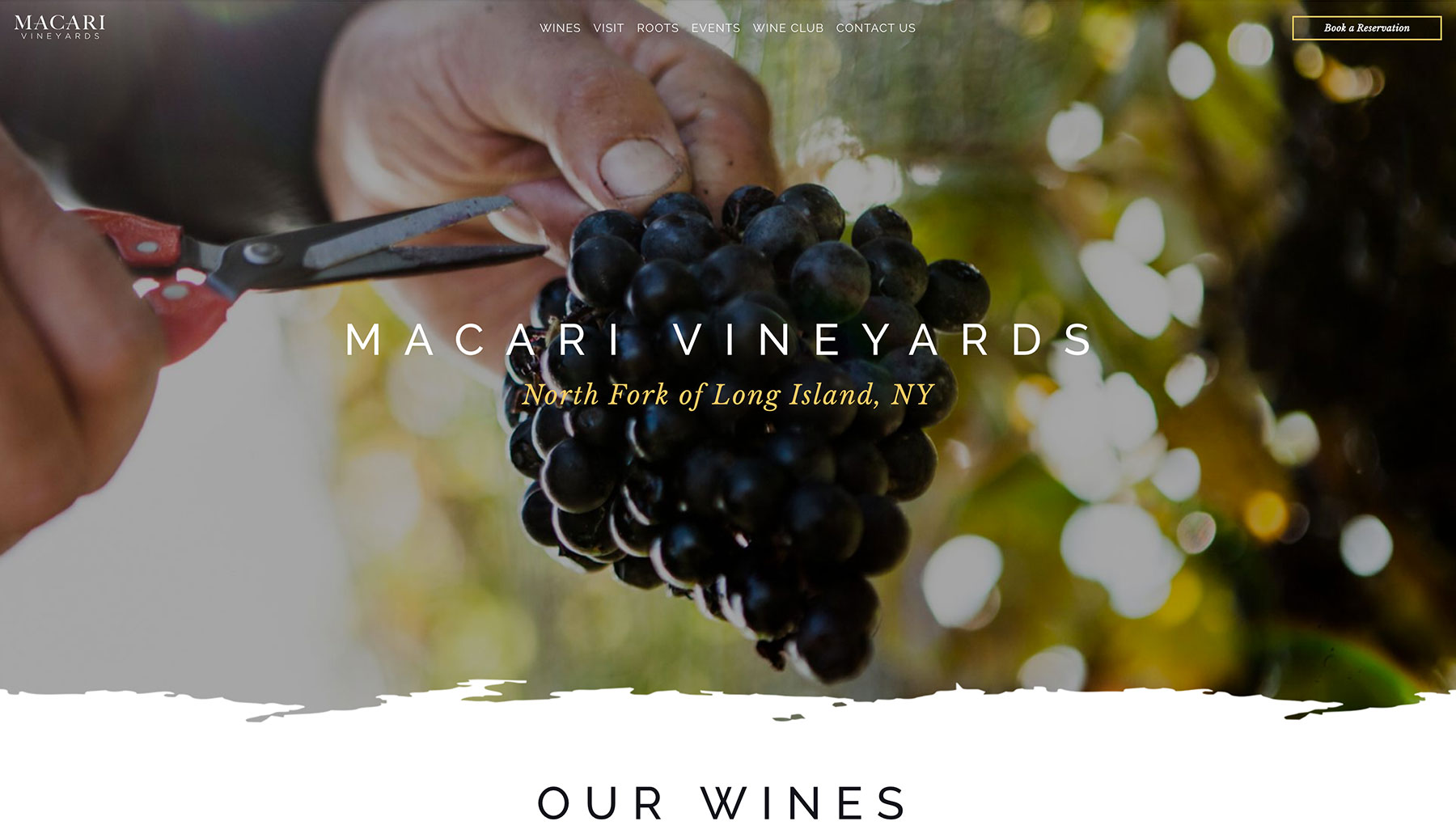
Macari Vineyards
Overview
An individualistic, elegant design that just breathes, never feels cramped, has great photography, has a well defined grid system, and uses modern technologies (including parallax backgrounds) to enhance the experience. I like that you can click on “Wines” and actually see some wines immediately.
Macari went the extra mile and added an Instagram feed to their home page. I also like that their “book a reservation” module, powered by Peek, is fast and easy to use.
I think they could do a little better job of selling their wine club. It would help to spread out the information into distinct chunks rather than lumped a couple paragraphs. Perhaps something a little closer to Monticello Vineyards’s wine club page, explored near the bottom of this list. Macari’s Wine Club page almost feels unfinished, with the “Join Now” action simply opening up the user’s e-mail program. Many other sites have some sort of online signup method.
Overall, an excellent site with very pretty visuals and attention to detail.
What’s Working
Unique, artistic design. Wines visible immediately when shopping. Inclusion of an Instagram feed.
Areas for Improvement
The Wines page takes a little too long to load all the wines, making it seem like it’s an empty list at first. Some enhancement should be made to better sell their wine club memberships.
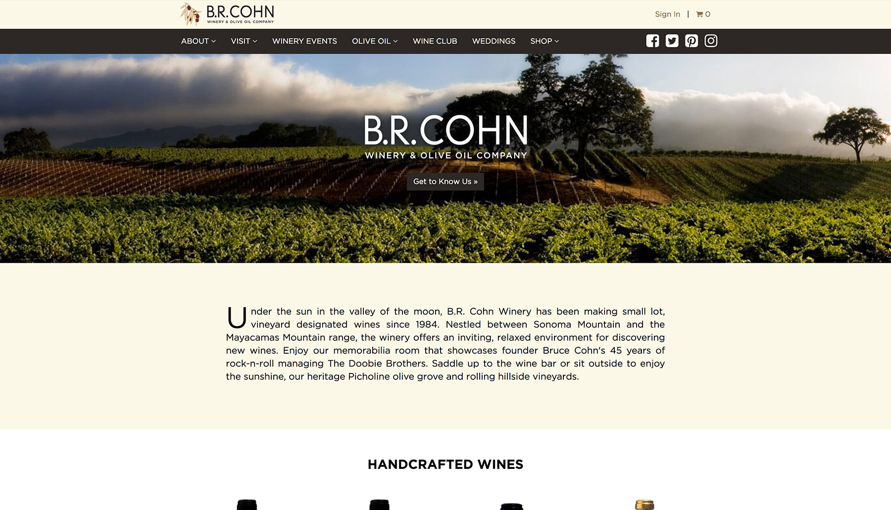
B.R. Cohn
Overview
B.R. Cohn’s website isn’t the most flashy design, but it has its parts that are very good. Take for example their Winery Events page; well designed, responsive calendars are hard to find and even harder to make. The calendar on their events page is easy to read and looks great on any device.
Their Weddings page is also great, beginning with the ability to go straight to their inquiry form if you’re looking for it, and continuing with a lovely selection of photos followed by some details and, finally, video recaps of happy couples having their wedding hosted there. It really sells the experience.
What’s Working
An exceptional calendar of events. Brilliantly composed Weddings page. Strong use of a grid-system design.
Areas for Improvement
The drop-shadow effect for the logo (see above) could use a little clean-up, though this is admittedly a taste thing.
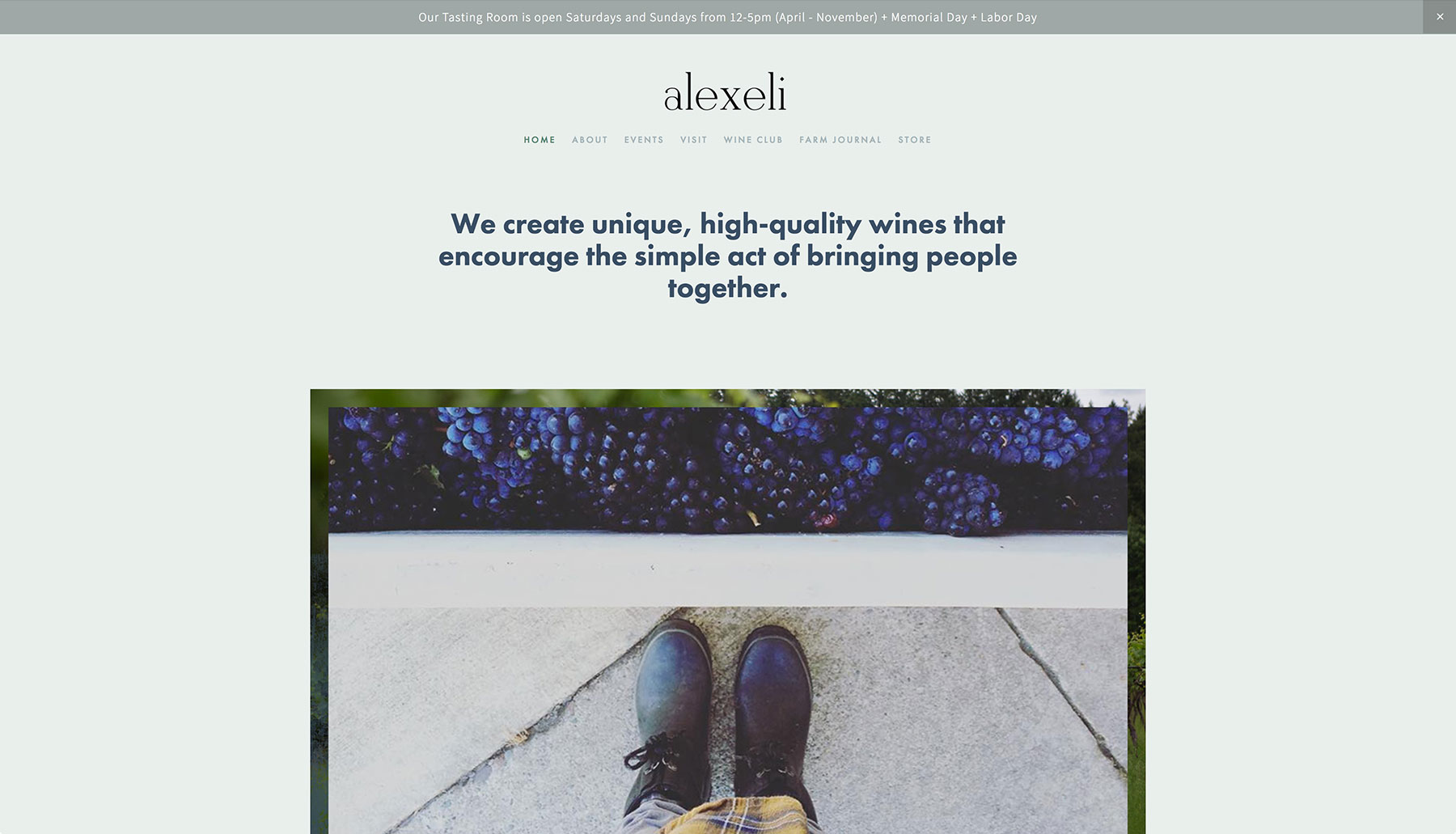
Alexeli Vineyard + Winery
Overview
Have you ever seen a stronger value statement from a winery? Hard to ignore and hard not to resonate with – their mission is to bring people together with their product. That’s story telling, perfected.
You might notice that there isn’t a full-screen photo of a vineyard at the top – the photo they’ve chosen is contained within a specific width rather than stretching to the edge of the browser. Alexeli’s designer thoughtfully chose not to follow the full-width photo pattern, and their site is all the more unique for it. Where most wineries put the photographic focus on their vineyard, Alexeli chooses to focus on their family, their process, and their humanity. I really like that the first image we see is from the perspective of a worker, boots and all.
I love this site because it’s so incredibly simple and completely unfussy, with muted colors and little distraction. This style doesn’t suit everyone, but it’s a fresh take in this list of some rather extravagant winery sites.
What’s Working
Charming simplicity. Nice photos.
Areas for Improvement
The font in the Newsletter signup box at the bottom could be a little larger – it can be difficult to read a serif font when it’s that small.
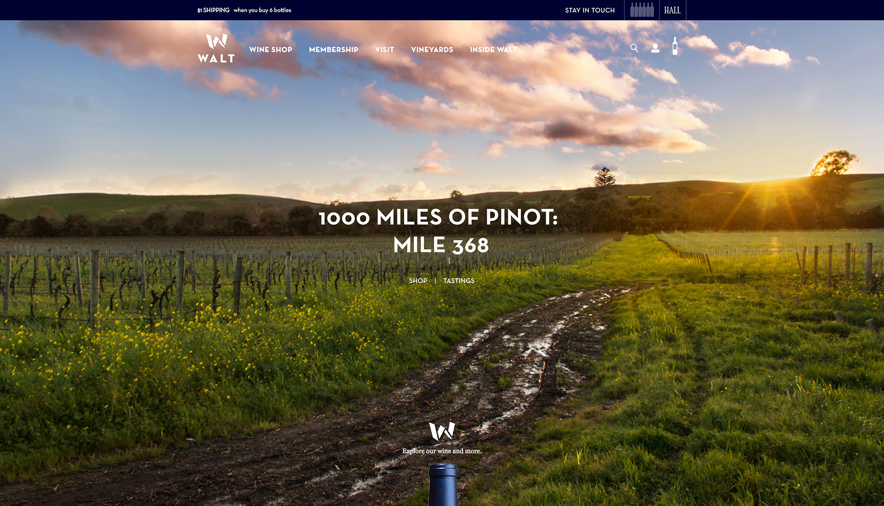
Walt Wines
Overview
For a site with lots of photos, Walt Wines’s website loads fast! The home page has lovely photos and clear guidance to help you get around. Walt Wines does a particularly good job at communicating their story (see “Inside Walt”) and they even dedicate pages to wine tips and pairing recipes.
I really enjoy their educational approach – many of the sub-pages under “Vineyards” are packed with information that most of their customers probably didn’t know. Their “6 away from $1 shipping” module is clever – it fills up as you add more bottles to your cart, providing incentive for the shopper to purchase more.
The site has a clean design, though sometimes the text spacing is weird and the font can be slightly too small. Also, this site is practically identical to their partner company Hall Wines.
What’s Working
Super fast load time. Great photography and typography. Unique reward system. Excellent educational content.
Areas for Improvement
Age-verification barriers are annoying and ineffective, but unfortunately may be necessary for Walt Wines to use.
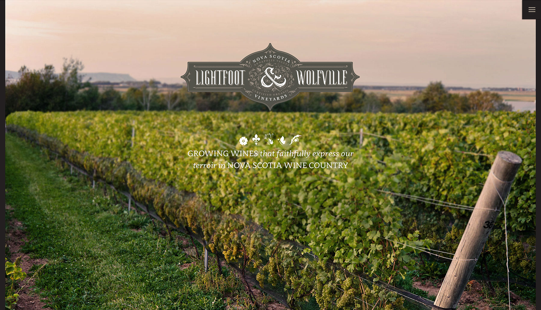
Lightfoot and Wolfville Vineyards
Overview
Lightfoot and Wolfville’s website makes great use of beautiful full-screen photography, especially on their homepage. I’m a sucker for detailed vintage information and interactive elements, and L&W’s website has no shortage of either. Under the “Vines” section on the home page, clicking the + icon brings up an informative table about their vineyard, even down to fine details such as row orientation. I love that they go as far as describe their individual wines in different phases, from “In The Cellar” to “In The Glass.”
Naturally, their website looks good on my phone, has nice typography, and feels open and spacious. At times, their use of empty space can feel a little unpolished and slightly overwhelming. Too much of a good thing.
What’s Working
Entertaining home-page elements. Detailed information. Nice photography.
Areas for Improvement
Spacing feels weird at times – refine it.
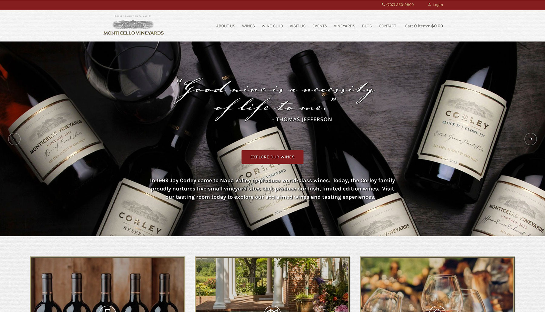
Monticello Vineyards
Overview
Monticello’s website has a very pretty design that almost feels like looking at a bottle of wine itself. It features lovely readable type, inspiring photography, and modern technologies such as parallax backgrounds.
Their Events page is nice, using a CellarPass integration to manage ticket sales, and I appreciate that while their Wine Club page is full of information, it’s laid out in a way that makes the details easy to understand.
I will say that their e-commerce integration leaves something to be desired from a design standpoint, with strange spacing at times and uneven buttons. Most importantly, I’d like to just dive right in to the bottles themselves rather than have to choose a category first.
What’s Working
Unique design aesthetic. Modern web technologies. Compelling story-telling.
Areas for Improvement
Wine shopping – design is messy and could use some serious refinement. Don’t make me choose a category before I can see any wines!
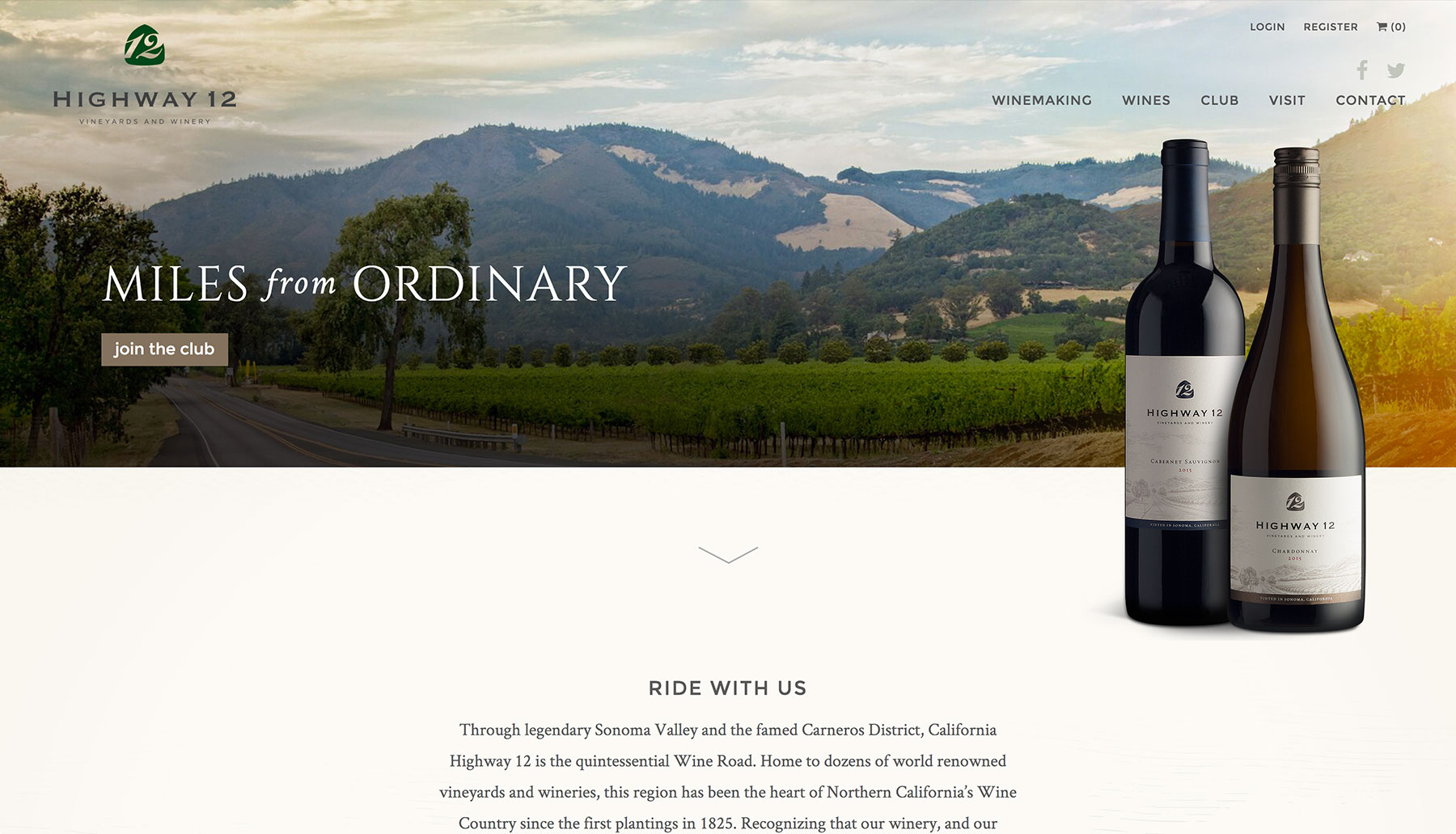
Highway 12
Overview
Highway 12 makes good use of white space with its full-width sections and classy photography. Their website is clean, easy to navigate, and easy to read thanks to generous font sizes and spacing. They also have a nice Google Maps integration on their Visit page, which more wineries need to adapt.
Speaking of that Google Maps integration, I highly recommend disabling the mouse-scroll zoom feature on the map. Leaving it enabled means that when you’re scrolling through the site, whether it be with a mouse or a trackpad, you run into a roadblock once you get to the map, as the scrolling feature is hijacked into a zoom action instead. When that happens, it makes for a jarring, unwelcome interruption. See Stratus’s website above for a great example of a map integration that doesn’t interrupt. (Google’s Maps API has updated in such a way that this is no longer an issue for anyone!)
Also, while the large fonts make for nice readability, it feels like this site was designed on a very large screen with very large screens in mind as the standard. Most people are viewing websites on laptops or phones, not 21-inch+ screens.
What’s Working
Clean, spacious design. Strong photographic focus.
Areas for Improvement
The design feels a little too large sometimes.
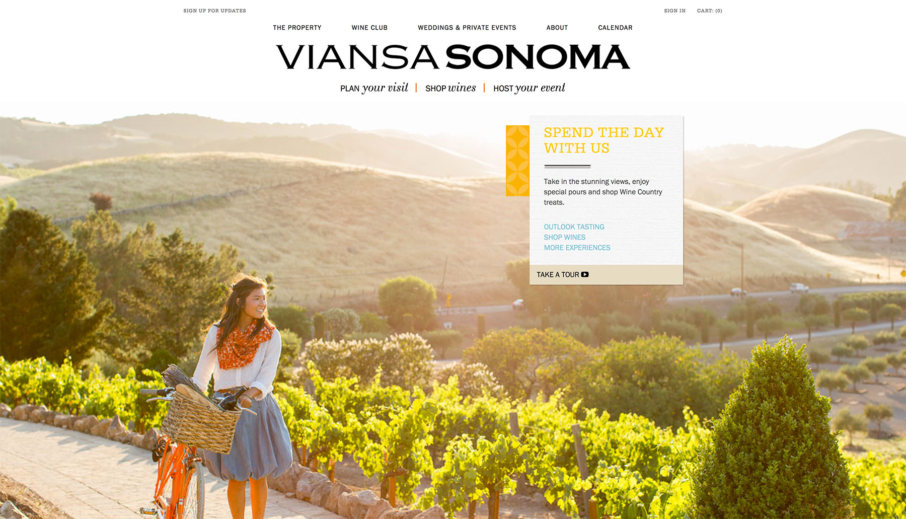
Viansa Sonoma
Overview
The second winery from VWE on this list, Viansa’s site is a wonderfully simple one that, while a little text heavy, is easy to explore. Guided sub-navigation on the home page makes it simple go where you want, utilizing action-based language like “Plan Your Visit” and “Shop Wines.” Their shopping cart integration is great, and on the wine selection page, you can immediately see all their wines.
The overall feel is a joyful one. The slideshow on their Weddings page is lovely. Perhaps on the home page, a more prominent, singular call to action would help.
What’s Working
Sensible navigational elements. Wines immediately visible when shopping.
Areas for Improvement
Stronger call to action on the home page – pick the best possible action your ideal user could complete and call attention to it.
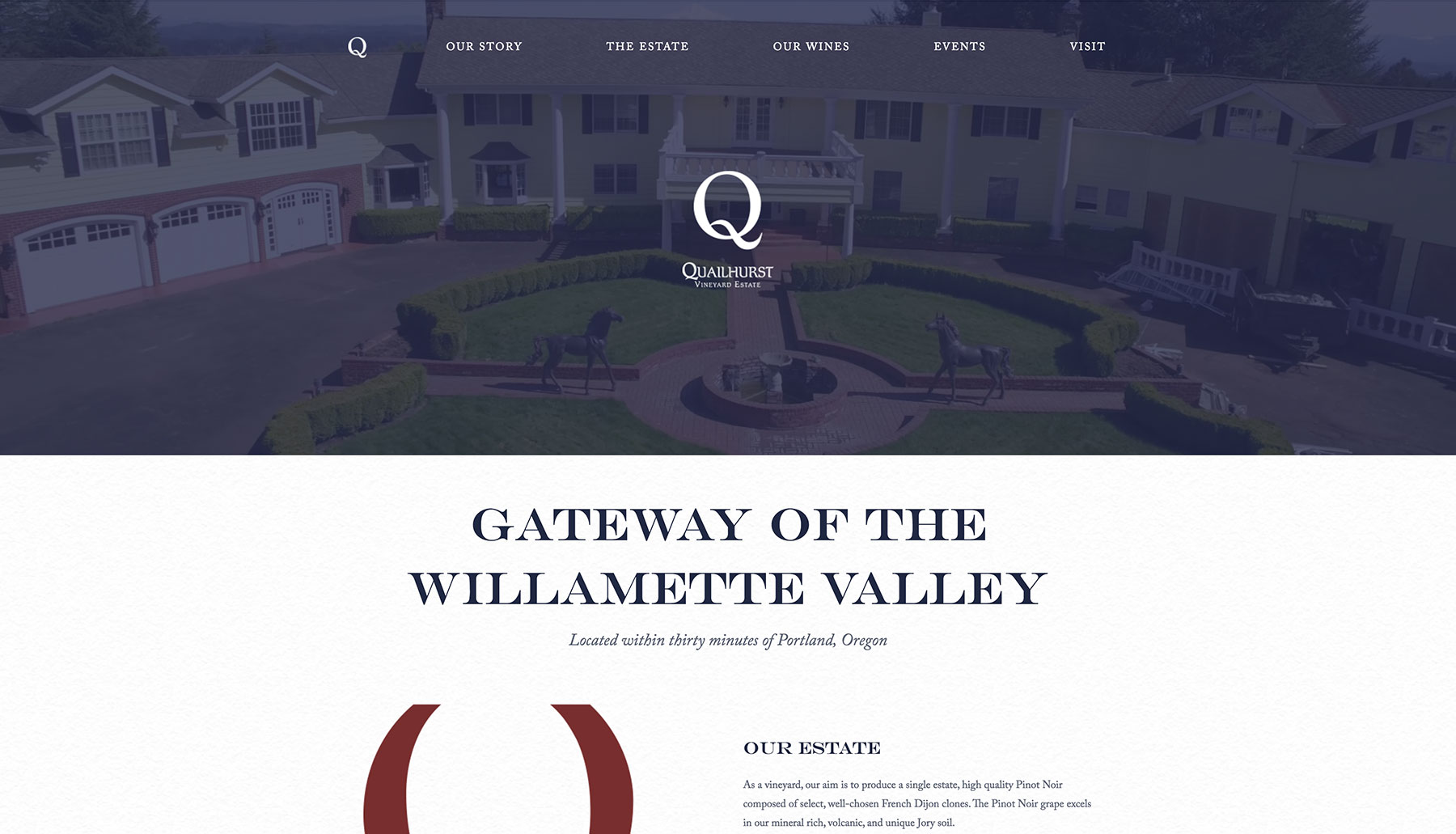
Quailhurst Vineyard Estate
Overview
I was hesitant to shamelessly plug a site we made in this list, but I had to include it because it features a background video right on the homepage. I wish more wineries would implement videos of their grounds shot with aerial drones, as there’s nothing more enticing than seeing the location in video form right there on the page.
Aside from aerial drone footage of a vineyard, busy tasting rooms are an excellent opportunity for video to be included on the website. Quailhurst has a beautiful location, and I hope to see more of it on their site in the future. Some variation in the photos used for the background image headers would be nice to see as well.
What’s Working
Aerial drone video! That’s the only reason I plugged one of our clients’ sites, though there’s plenty else to take notes on here.
Areas for Improvement
Greater diversity of photography – many pages are currently reusing the same background image at the top.
3 Wineries That Deserve Honorable Mention
For one reason or another, these sites didn’t quite stand out as much as the ones above. That’s not to say they aren’t good websites – they’re fine examples to take notes from, and that’s why we’ve included them below.
Enso
Enso’s use of video featuring people in their space is really nice. Its design is decidedly modern, which makes sense given the urban style of this winery. However, their calendar leaves much to be desired (especially on a phone), and too often is there just way too much text all at once. That said, it’s still a nice, modern site.
Lavinea
Lavinea’s site has a totally mesmerizing home page, utilizing gorgeous photos and parallax backgrounds that lead into one another. The site overall just isn’t feature-rich enough to compete with some of the others, but the home page is so pretty it deserves mention. I also have a strong distaste for scroll-jacking, and you’ll notice that this site scrolls differently than you expect it to.
Wildstock Wines
Wildstock Wines’s website has outstanding photography, but it’s often hard to read because of their use of that soft marigold color against the off-white background. Its design may feel a little clunky at times, but there are far worse winery websites out there.
Eyes On The Future: Messenger Marketing

In the last year, the recent trend of businesses adopting Messenger Marketing has exploded, and it’s not slowing down any time soon.
Wineries looking to stay current are taking advantage of the 80%+ open rates that Messenger Marketing sees, compared to the frustrating 30% average open rate that wineries seem to get from Email Marketing. They know that the collective attention of consumers is in messaging apps now, much more than it is in email.
Just like there are platforms for Email Marketing (Mailchimp, Constant Contact, ActiveCampaign), so are there platforms for Messenger Marketing. Depending on which platform you choose, you can even do things like create automated Messenger Bots, embed a Facebook Messenger window on your website, and EVEN turn an entire web page into an interactive messaging application.
Some great websites here. Love the way you talk about the strengths and weaknesses of all of them. My favorite was Walt Wines
Pingback: Not Using A Call To Action Button On Facebook? This Update Will Make You Wish You Had | Wine Zebra
Pingback: Understanding Winery Website Audits - Wine Zebra
Pingback: 4 Factors That Boost Sales On Winery Websites - Wine Zebra
Pingback: Why Your Winery's Website NEEDS To Be Responsive
Pingback: Best Winery Websites 2019 - Wine Zebra